
Adobe has provided one of the most useful feature/utility for developing communities components, known as Communities Component Guide. It is an interactive development tool for the Social Component Framework (SCF). It provides a list of available communities components and complex features built of community components.
Apart from providing the basic information for each component, it lets you experiment with the features as well. You can access the community guides on your instance by following the below URL
http://<server>:<port>/content/community-components/en.html.
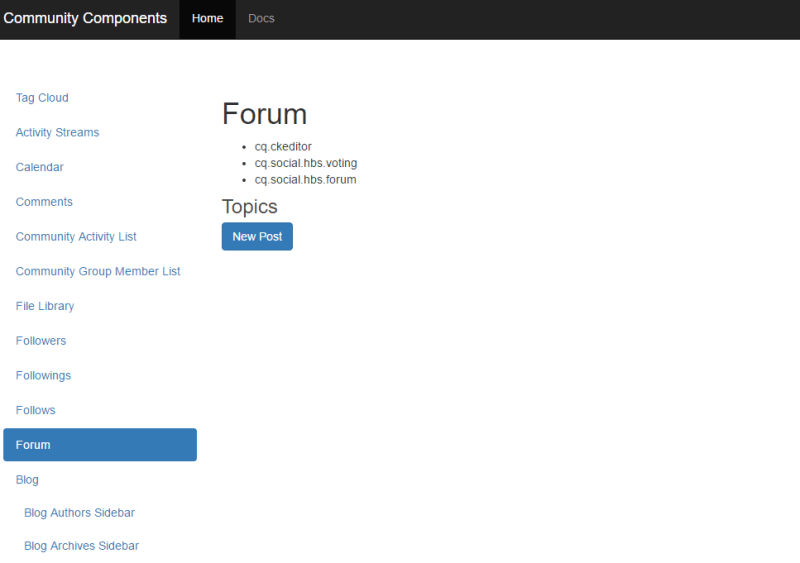
The left rail provides the list of the SCF components. Clicking on the component will display the information related to that component. e.g.
- You should be able to see the title of the component.
- Clientlibs are very important when it comes to community components. Your component might not behave correctly if the required clientlibs are not included on the page. You should be able to see the required clientlibs for the selected component.
- It also has the instance of the component on the page so that you can experiment with it. The behavior of the component depends on the instance where you are accessing the guide from. If you are accessing it on the author, then you should be able to see the dialog, can edit the template scripts etc. If you are accessing it on publish then you should be able to experience the features as a site visitor.
It looks like below:
Customization:
If you want to do some customizations on the fly, the scg:showIde property must be added to the component page’s content JCR node and set to true.
Lets’ take an example of the comments component:
- Go to CRXDE Lite e.g. http://<server>:<port>/crx/de
- Select the component’s jcr:content node e.g. /content/community-components/en/comments/jcr:content
- Add below property and save.
- Name scg:showIde
- Type String
- Value true

- Reload the Comments page in the guide. You should be able to see 3 more tabs.
http://<server>:<port>/content/community-components/en/comments.html
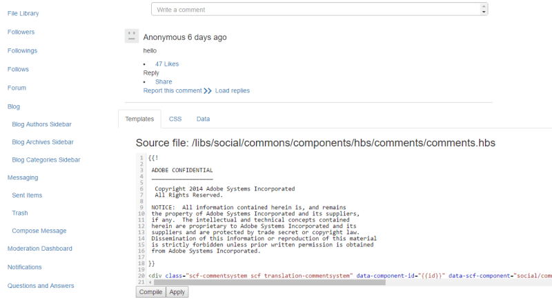
- Template Tab: It lets you see the template associated with the component. You can make changes to it, compile and see the results on the screen. Nothing will be saved in the repository.
- CSS Tab: It lets you modify the CSS and see the changes on the component placed on the page.
- Data Tab: To modify the.social.json associated with the component.
If you are a beginner and trying your hands with AEM communities, this will surely help you.
Hope it helps !! 🙂
 TechCookies