Extending the communities component – Part 2

In one of the earlier post, I talked about extending the communities component. While working on this in my project, I faced another problem. I had a use case to override the toolbar in order to adhere to the custom styles we wanted to apply on the component.

Problem:

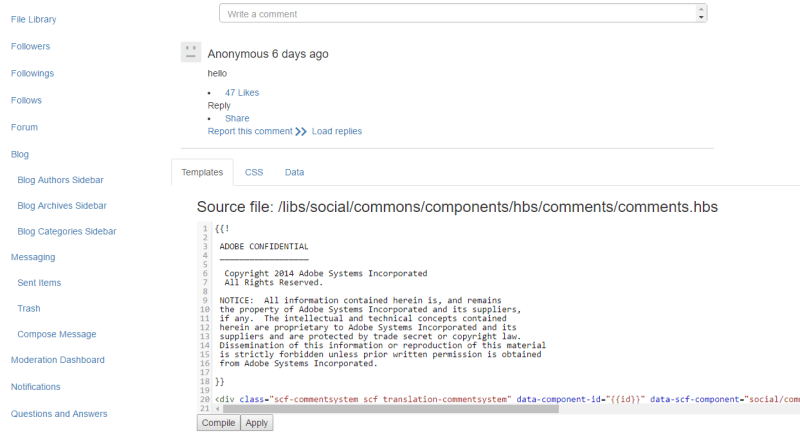
  • In comment.hbs, the below line includes the toolbar.hbs. 
{{include this template="toolbar"}}
  • The problem that I faced was that my template changes were not getting picked. I was over-riding the toolbar.hbs, but it was always picking the default OOTB template file.
  • The reason is that whenever we post a comment, it gets saved in the usergenerated content and resource type always points to the OOTB component.community.PNG
  • This resourceType property gets picked up and passed as a parameter to a servlet which resolves the template. You should be able to see the below call in the networks tab of the browser.

http://localhost:4502/services/social/templates?resourceType=social/commons/components/hbs/comments/comment&ext=hbs&selector=toolbar

Solution:

To resolve this issue, we need to tell AEM that it needs to pick our custom resource type rather than OOTB one. There is a configuration for this in the component.

  • Go to the design mode and open the design dialog for comments component.

communities-design-dialog

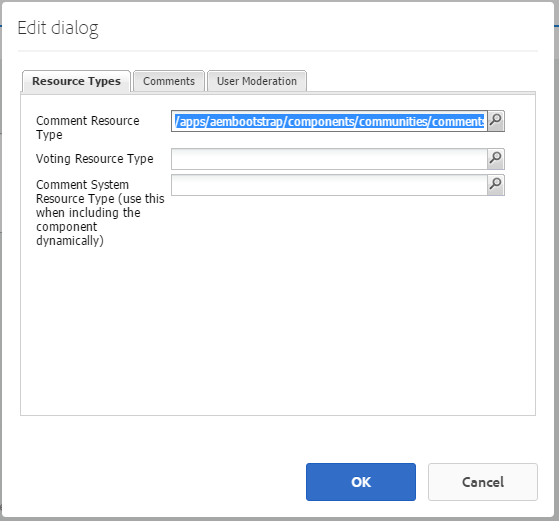
  • As shown in the above image, you need to specify the path of the custom comment resource type that you want to use in the design dialog. Once you save the changes, you should be able to see your template loading fine.

Hope it helps !! 🙂

Advertisement

Communities Component Guide

Adobe has provided one of the most useful feature/utility for developing communities components, known as Communities Component Guide. It is an interactive development tool for the Social Component Framework (SCF). It provides a list of available communities components and complex features built of community components.

Apart from providing the basic information for each component, it lets you experiment with the features as well. You can access the community guides on your instance by following the below URL

http://<server>:<port>/content/community-components/en.html.

The left rail provides the list of the SCF components. Clicking on the component will display the information related to that component. e.g.

  • You should be able to see the title of the component.
  • Clientlibs are very important when it comes to community components. Your component might not behave correctly if the required clientlibs are not included on the page. You should be able to see the required clientlibs for the selected component.
  • It also has the instance of the component on the page so that you can experiment with it. The behavior of the component depends on the instance where you are accessing the guide from. If you are accessing it on the author, then you should be able to see the dialog, can edit the template scripts etc. If you are accessing it on publish then you should be able to experience the features as a site visitor.

It looks like below:

component-guide

Customization:

If you want to do some customizations on the fly, the scg:showIde property must be added to the component page’s content JCR node and set to true.

Lets’ take an example of the comments component:

  1. Go to CRXDE Lite e.g. http://<server>:<port>/crx/de
  2. Select the component’s jcr:content node e.g. /content/community-components/en/comments/jcr:content
  3. Add below property and save.
    • Name  scg:showIde
    • Type   String
    • Value  truecomments-comp
  4. Reload the Comments page in the guide. You should be able to see 3 more tabs.
    http://<server>:<port>/content/community-components/en/comments.html

comments-comp-edit

  • Template Tab: It lets you see the template associated with the component. You can make changes to it, compile and see the results on the screen. Nothing will be saved in the repository.
  • CSS Tab: It lets you modify the CSS and see the changes on the component placed on the page.
  • Data Tab: To modify the.social.json associated with the component.

If you are a beginner and trying your hands with AEM communities, this will surely help you.

Hope it helps !! 🙂


Extending a Communities Component

More often than not, to meet the business requirement we need to create our custom components. It’s easy when it comes to AEM Sites, but I faced a lot of problems while extending the communities component. AEM Communities provides a lot of the OOTB components which in most scenarios meets our requirement. But, these components have basic layout and skinning. If you have to modify the appearance or behavior of the component that matches your site layout and meets the requirements then you would have to customize it. As explained in the documentation also  that there are two approaches for the same:

  • Overlaying: Overlaying the component changes the default component and affects every reference to it. Since we are overlaying, we would be copying it to apps hierarchy and then making changes to it. As paths are first looked into apps and then in libs. So overlaying it simply overrides the default behavior.
  • Extending: Extending the component limits the scope and is the recommended way to customize component.

While working on customizing the component, I faced quite a lot of issues. I followed this documentation but I was still not able to get it working. There is an issue here w.r.t the way clientlibs being defined. While defining the clientlib, categories  should be unique, as in this case

aembootstrap.communities.comments

clientlib-social

Add this as a dependency in the main clientlib.

clientlib1

After these changes, your component should work fine. It looks like below once you drag and drop this component to the page and post comments. 🙂

communities-example

I have also added it the Github Repository here.

Feel free to comment if you face any issues. 🙂

Hope it helps !! 🙂